Signage
Signs at the airport direct, inform and identify the various flows, jurisdictions, spatial arrangements and procedures of air travel.
︎︎︎ Related entries:
Maps
PA Announcements
Artwork
︎ Random Entry
Tags: wayfinding, sensory (visual),
directionality
Maps
PA Announcements
Artwork
︎ Random Entry
Tags: wayfinding, sensory (visual),
directionality
Design Decisions
There is a sign for nearly everything at the airport. In contrast to the landmarks, mental maps, and paths used to explore urban environments, we use signs to understand our position within the complex infrastructure of air travel [1]. Signs at the airport direct, inform and identify the various flows, jurisdictions, spatial arrangements and procedures of air travel. They are such critical components of the airport navigation experience that significant resources are devoted to quantifying the criteria for effective sign design.
National entities have published signage standards such as the FAA’s Guidelines for Airport Signing and Graphics or the BAA’s British Airport Authority Signs Manual. Fonts, formatting, placement, color, background, and hierarchy are just a few of the myriad design characteristics that have been evaluated and quantified by researchers and airports.
Creating legible, concise signage to direct a multitude of complex flows of both goods and passengers has historically been a challenge for designers [2]. A variety of methods have been deployed with varying degrees of success. Color-coding was a popular strategy in the 1960s and 70s, particularly in the United States, though this strategy fell out of favor partly because roughly 12% of the population is color-blind. Pictograms were favored by European airports in the 1970s and 1980s, however they are prone to misinterpretation and ambiguity [3].
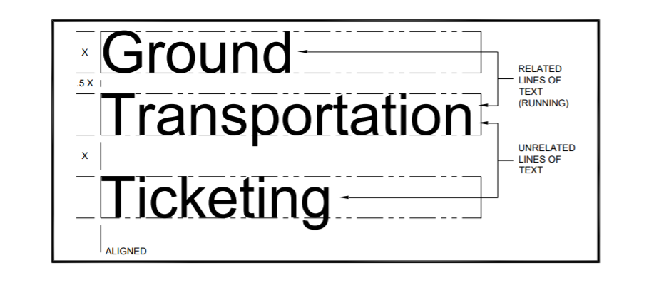
Figure 1. Line spacing examples
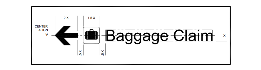
Figure 2. Spacing example relationship between arrow, symbol, and text
“We have a sauna in the airport and the pictogram for that is a person sitting in a room surrounded by snowflakes," says Copenhagen's Mr. Haugaard, who himself finds that design a bit oblique. Today, European airports retain only the occasional pictogram, and usually accompany it with simple words." [3]
Today, airports employ a range of strategies. Signs usually feature a combination of words and pictograms, following the graphic standards and best practices established by various regulatory agencies. Font choice has been standardized to such a degree that 80% of airport signage uses one of three fonts: Helvetica (42%), Frutiger (32%) or Clearview (6%) ( Waller). Each font shares similar characteristics: open counters, large x-heights, and consistent stroke-width ratios that all support the legibility [2]. Alternative navigational strategies have also been employed. For instance, public art is often deployed as a navigational aid, or placed in such a way that it draws air travelers into a particular zone in the airport [4].
Effects on Passengers
“The arrow… turns place into passage, striates space into controlled flows, and urges the traveller to ‘move on’. It is a point sign that leads the way to a consideration of the technologies... that provide the navigational and behavioural guidance that is increasingly in evidence, not only at the airport but in all public spaces” [1].
The prevalence and importance of signage in the space of the airport was examined by Marc Augé in his seminal 1995 text Non-Places. He writes that ‘The link between individuals and their surroundings in the space of non-place is established through the mediation of words, or even text’ [5]. Lacking the distinct physical landmarks and heterogeneous characteristics of urban environments, signs become an essential component of wayfinding and spatial legibility at the airport. Great signs go unnoticed - they seamlessly facilitate the users to find their way within the airport. Illegible signs, however, can induce stress, confusion, feelings of incompetence. Methods have been developed for quantifying topological complexity of floor plans [6].
From a typographic perspective, recent research has shown that contrary to expert predictions, alternative typefaces can be just as legible as the ubiquitous san-serif typeface. In one study, “character width was a more significant factor in legibility, with condensed sans serif performing relatively poorly. The use of multiple methodologies led to a richer basis for decision-making: the qualitative research revealed clear genre expectations among airport users for sans serif signs; the expert reviewers raised a range of additional issues of genre, culture and context" [7]. Passenger experience level has been shown to impact preference for particular navigational aids, with infrequent travelers relying equally on maps and signs and frequent travelers preferring to navigate the airport using signage alone [8].
One challenge that many passengers face in interpreting airport signage is due to the fact that signs convey information about three-dimensional navigation on a two-dimensional surface [8]. This introduces a certain degree of ambiguity and confusion as, for instance, the same arrow can be read as pointing “up” or “straight ahead”.
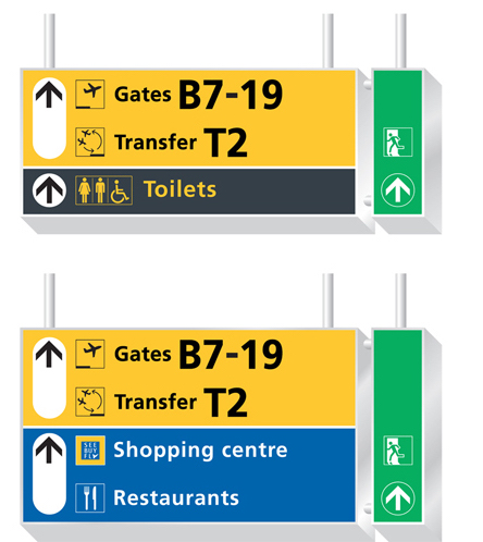
Figure 3 Recommendations from the Airport Sign Managers Network at San Jose International Airport
- Fuller, Gillian. 2002. “The Arrow--Directional Semiotics: Wayfinding in Transit.” Social Semiotics 12 (3): 231–44.
-
National Academies of Sciences, Engineering. 2011. Wayfinding and Signing Guidelines for Airport Terminals and Landside.
-
O’Brian, Bridget, and Brian Colman. 1995. “Signs and Blunders: Airport Travelers Share Graphic Tales --- Way-Finding, Lost-Getting Are Rites of Passengers; Confusion Seems by Design.” The Wall Street Journal Europe, April 13, 1995.
-
Hubregtse, Menno. 2016. “Passenger Movement and Air Terminal Design: Artworks, Wayfinding, Commerce, and Kinaesthesia.” Interiors 7 (2–3): 155–179.
-
Augé, Marc. 1995. Non-Places: Introduction to an Anthropology of Supermodernity. 2nd English language ed. London ; New York ; Verso.
-
O’ Neill, Michael J. 1991. “Evaluation of a Conceptual Model of Architectural Legibility.” Environment and Behavior; Beverly Hills, Calif. 23 (3): 259–284.
-
Waller, Robert. 2007. “Comparing Typefaces for Airport Signs.” Information Design Journal 15 (1): 1–15.
-
Andre, Anthony D, and Jefferson M Koonce. 1991. “Spatial Orientation and Wayfinding in Airport Passenger Terminals: Implications for Environmental Design.” PROCEEDINGS of the HUMAN FACTORS SOCIETY 35th ANNUAL MEETING, 5.